A Modern Perspective
A Modern Perspective
Quechan Casino Resort and nearby sister property Paradise Casino were planning renovations and looking to modernize their branding and messaging to unify the two properties while celebrating their individuality.
Research revealed that convenience was a primary factor in where guests chose to visit. It also uncovered the market perception that Quechan and Paradise offer more than their competitors. Each property offers its own distinct experience, but it was necessary to develop a messaging strategy that worked for both.
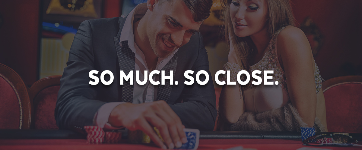
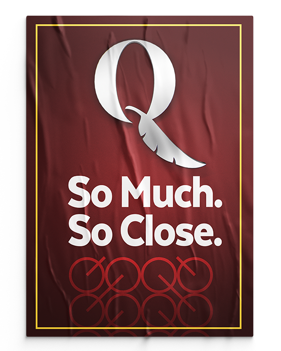
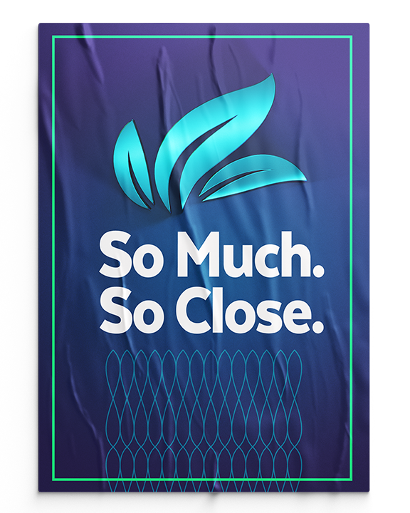
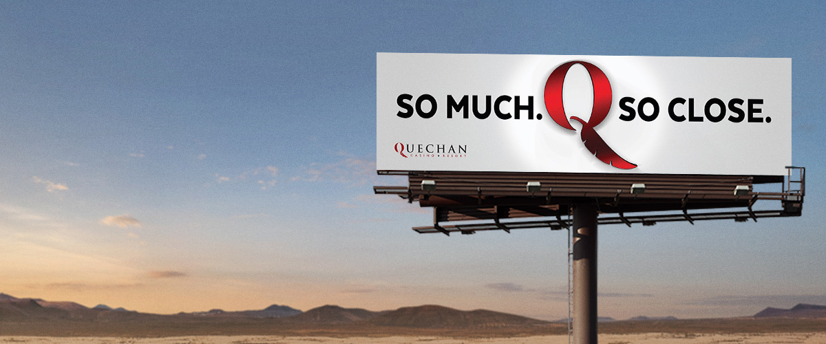
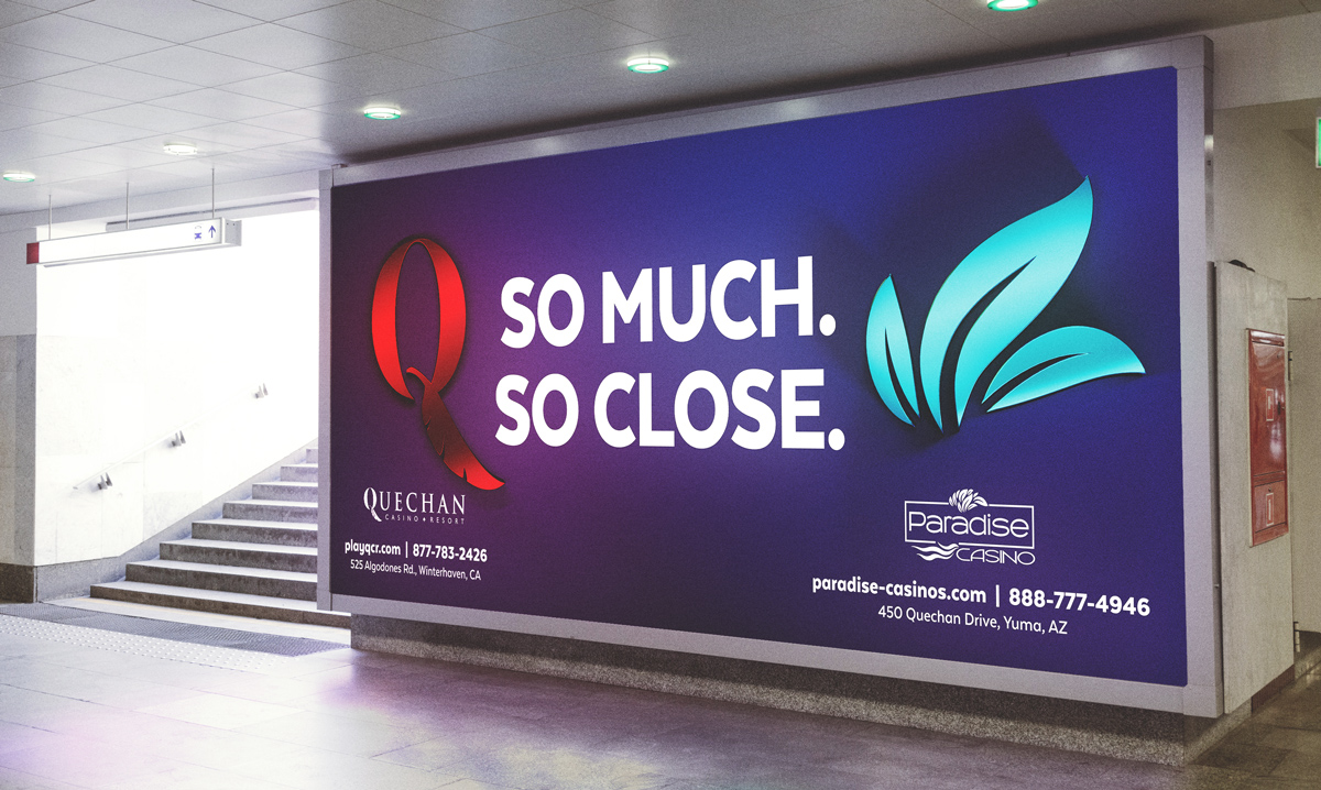
The tagline, “So Much. So Close.” was decided on as it fits both properties individually and works well for the overarching brand.
The challenge ahead was to create branding that would allow each property’s unique identity to show through while maintaining a similar aesthetic so viewers could immediately recognize and connect the two properties under one brand.
Depth in Simplicity
A design tool kit was thoughtfully and carefully developed for each property to pave the way for consistency and to aid in building brand equity.
Each design element contributes to the overall challenge of modernizing the brand and creating a proprietary identity for each property. Although the number of design elements are limited, they are flexible enough to scale throughout all communications the Casino puts out into the world—from brand messaging to promotional advertising these elements keep the visual voice intact.
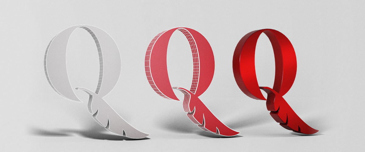
At the center of the Quechan Casino Resort design tool kit is the ‘3D Q’. This element was derived from the original, legacy ‘Q’ lettermark.
Evolving the lettermark into a 3D design element has proven to open the door to new branding and creative possibilities.

Finding a Voice
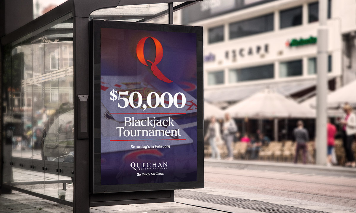
A clear voice and tone for the Quechan brand was paramount in moving the brand forward and positioning the two properties as the go-to casinos for fun, excitement, and exceeding guests expectations.
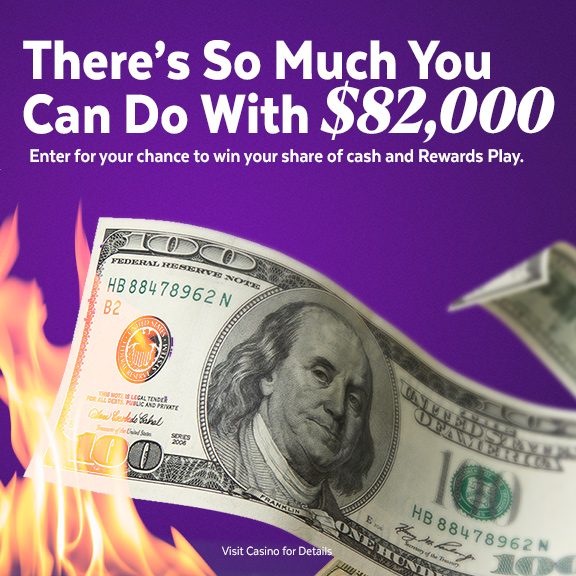
The tagline “So Much. So Close.” really starts to come to life with its influence on advertising headlines. Rather than simply communicating a traditional casino promotion, we took the opportunity to establish rules and guidelines to aid in effectively writing marketing copy that mixes gaming promotions with the brand message and positioning. This allowed us to formulate headlines such as, “There’s So Much You Can Do with $82,000!”, “Winning Two Cars is So Much Better!” and “So Close You Can Almost Taste It.”
We didn’t stop there. The brand voice we established goes beyond advertising and touches areas of the casino resort that are often overlooked to ensure players and guests have a consistent experience. Our holistic approach to messaging influences guests interactions, employee mannerisms, promotional advertising, digital products and more.
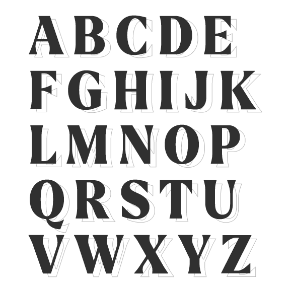
In addition to defining a new voice and tone we included two new font families to deliver copy and messaging in way that is genuine to the brand positioning and easy to read. These fonts have character fit for the visual and spoken voice all without sacrificing legibility.
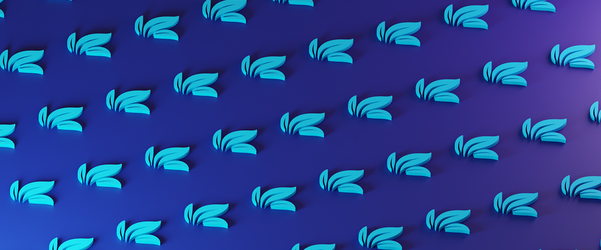
Turning Over a New Leaf
As was done with a Quechan, a design tool kit was also provided for Paradise Casino. Similar design elements have been produced, but the most challenging was creating a mark to the likes of the ‘3D Q’ used for Quechan. At the time of the creative exploration, Paradise had not yet established a mark that could be used independent of the primary logo.
We found opportunity in breaking apart the Paradise logo and forming a mark that could easily be recognized and identified as Paradise Casino.

Similar Projects

Feeling Inspired?
Let’s discuss your project and see it come to life.